2016년 1월 25일 월요일
2016년 1월 19일 화요일
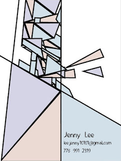
personal symbolic final logo
I tried to use primary color to create minimal symbol
It represents my basic emotions.I tried to symbolize J.
Logo research
Logo research assignment: Find 5 symbolic logos (not with text) and post them to your blog.

 Twitter: The Twitter marks include, but are not limited to, the Twitter name, the Twitter logo, the term “Tweet” and any word, phrase, image or other designation that identifies the source or origin of any of Twitter’s products. The Twitter marks represent the core values of our brand, from meaningful connections in real time to simple amplified expression.
Twitter provides service to share personal study or re tweet the same story to share.


The letters "L" and "G" in a circle symbolize the world, future, youth, humanity, and technology. Their philosophy is based on Humanity. Also, it represents LG's efforts to keep close relationships with our customers around the world. The symbol mark consists of two elements: the LG logo in LG Grey and the stylized image of a human face in the unique LG Red color. Red, the main color, represents our friendliness, and also gives a strong impression of LG's commitment to deliver the best. Therefore, the shape or the color of this symbol mark must never be changed.
Their logo is the fundamental visual expression used to identify LG. It expresses the quality and sophistication that is the hallmark of our products. It is simple, modern and distinctive. Consistent and proper usage of the logo is absolutely essential. The logo is symbolic of our steadfast reputation for excellence; therefore, any variation of the logo diminishes the visual identity of LG Electronics and its products.


- Describe the image/logo and any visual clues.
- Explain what the company does/produces/sells.
- Identify how the image represents the company.
- Then evaluate the logo and it's effectiveness in representing the company and the products.
Puma:Puma logo used cougar to show speed and power. Puma selling sportswear and sport shoes.
This image visualizes energy. It can provides energetic mood to viewer. People can think they will be energetic and fast when they try products that Puma selling.
This image visualizes energy. It can provides energetic mood to viewer. People can think they will be energetic and fast when they try products that Puma selling.
Twitter provides service to share personal study or re tweet the same story to share.
Pinterest: Pinterest is The visual bookmarking tool that helps you discover and save creative ideas.Designers were uniquely easy to get a good understanding of the Pinterest audience. The whole site is a giant dynamic moodboard for its users. They agreed that the previous logo was already a start in the right direction, and that keeping with a script logotype was appropriate. They needed something that seemed casual, but that also carried signs of careful craft. It was important to sense the touch of the hand in the forms, but to stay subtle.
They also wanted it to carry a feeling of nostalgia, without seeming retro. The need for contemporariness drove many of the initial experiments, where they played with fully upright scripts, and tuned down the range of line weight variance. The bolder type also served well under the ever-present logistical issue that the logo would be seen almost exclusively on screens at only a few pixels tall, where small details don’t translate well.LG: LG is the brand that is Delightfully Smart. "Life's Good" slogan, and futuristic logo are a great representation of what they stand for. Global, Tomorrow, Energy, Humanity and Technology are the pillars that this corporation is founded on; with the capital letters L and G positioned inside a circle to center our ideals above all else, humanity. The symbol mark stands for our resolve to establish a lasting relationship with, and to achieve the highest satisfaction for our customers.
The letters "L" and "G" in a circle symbolize the world, future, youth, humanity, and technology. Their philosophy is based on Humanity. Also, it represents LG's efforts to keep close relationships with our customers around the world. The symbol mark consists of two elements: the LG logo in LG Grey and the stylized image of a human face in the unique LG Red color. Red, the main color, represents our friendliness, and also gives a strong impression of LG's commitment to deliver the best. Therefore, the shape or the color of this symbol mark must never be changed.
Their logo is the fundamental visual expression used to identify LG. It expresses the quality and sophistication that is the hallmark of our products. It is simple, modern and distinctive. Consistent and proper usage of the logo is absolutely essential. The logo is symbolic of our steadfast reputation for excellence; therefore, any variation of the logo diminishes the visual identity of LG Electronics and its products.
Unicef:
The United Nations Children’s Fund (or UNICEF) is a special program of the United Nations established on December 11, 1946 that focuses on issues such as the improvement of the healthcare facilities, malnutrition, education and general welfare of children in developing countries.
Shape and Font of the UNICEF Logo
The current version of the UNICEF logo consists of four distinct elements. These include the image of a mother and child, a globe, olive branches and the organization’s name “unicef” in a very simple yet powerful lowercase typeface. The UNICEF logo is widely regarded as one of the most recognizable and memorable emblems in the non-profit world.
Colors of the UNICEF Logo
The use of blue color in the UNICEF logo stands for approachability, prosperity and grace of the organization, whereas the white color depicts nobility, peace and purity.
2016년 1월 18일 월요일
2016년 1월 5일 화요일
5*5*5 Design research
David Carson
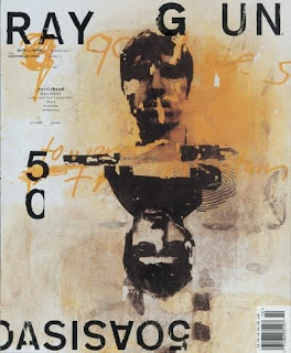
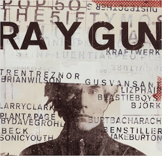
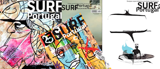
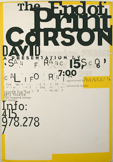
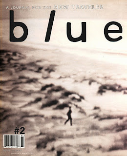
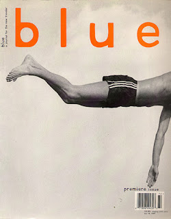
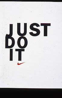
David Carson (born September 8, 1954) is an American graphic designer, art director and surfer. He is best known for his innovative magazine design, and use of experimental photography. He was the art director for the magazine Ray Gun, in which he employed much of the typographic and layout style for which he is known. In particular, his widely imitated aesthetic defined the so-called "grunge typography" era.


Wim Crouwel
He designed many geometric word marks
MODERNIST, FUNCTIONALIST, PURIST


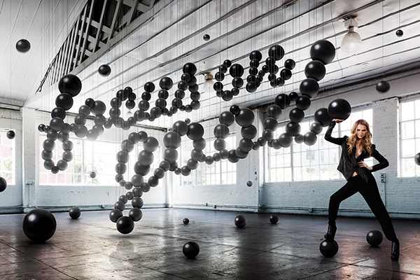
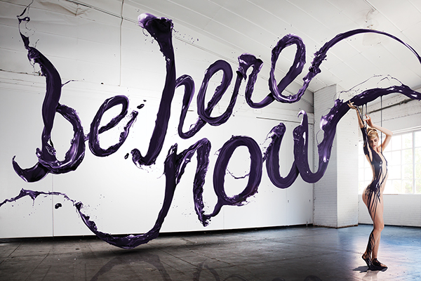
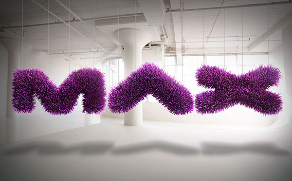
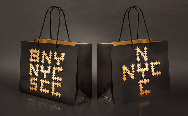
Jessica walsh
Designer& Art directer
Working in NYC. Her works has won awords from the type directer's club, art directer's club, SPD, print, and graphics she recieved various distinctions such as computer art's "Top rising star in design", and an ADC "Young gun.
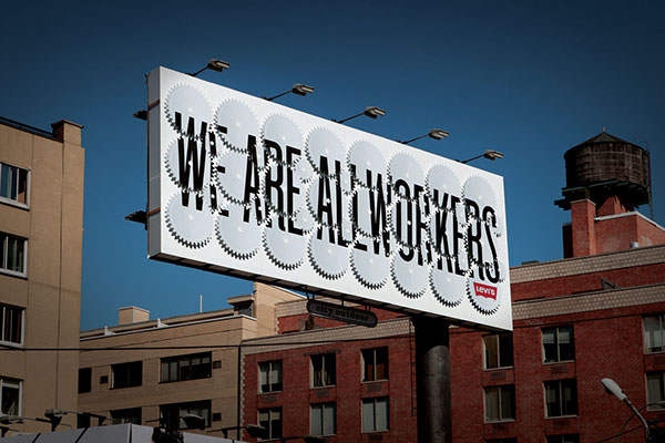

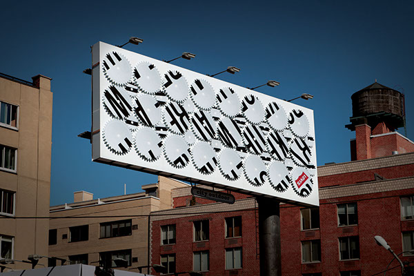
Studio Mut
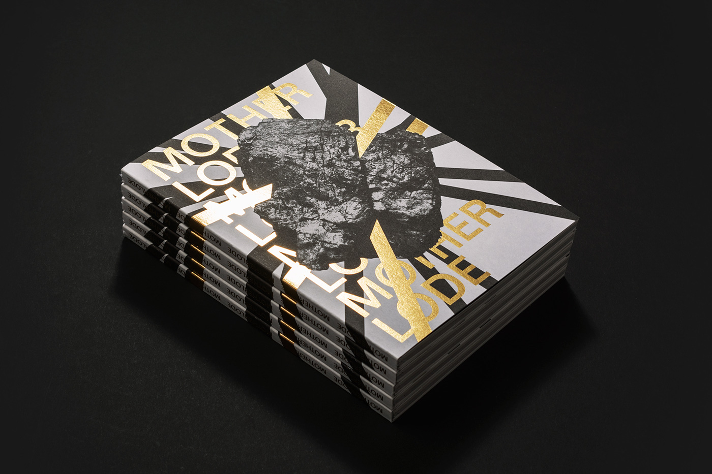
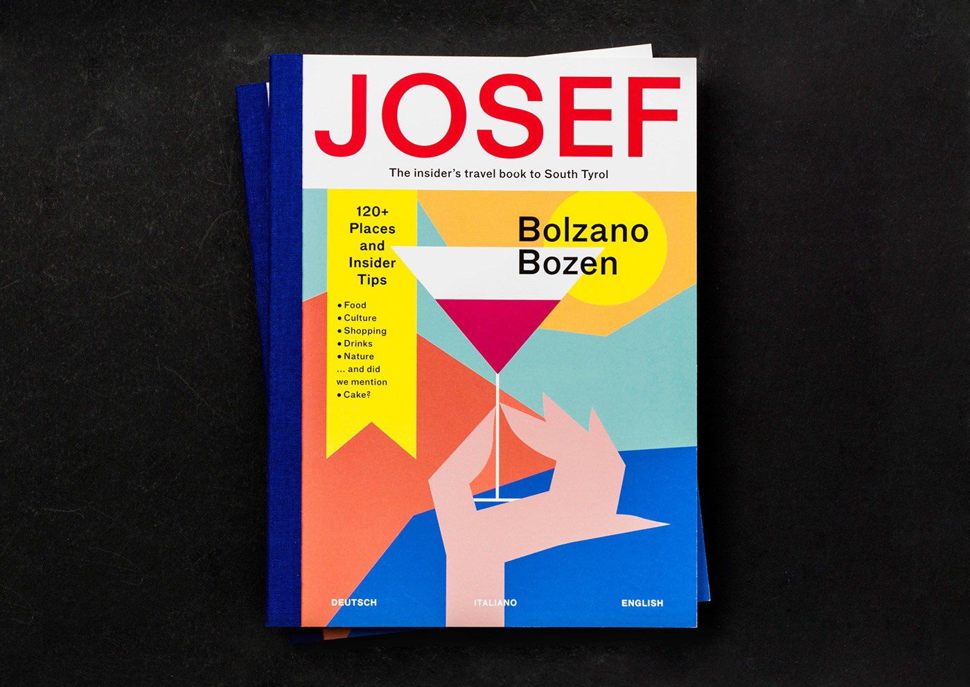
-Studio Mut is a graphic design studio founded by Thomas Kronbichler and Martin Kerschbaumer, based in Bolzano, Italy. We specialise in identity, print, editorial and web design for clients spanning art, culture and commerce. We seek for simple and powerful solutions, bold aesthetics and surprising outputs across all platforms. Our work has been described as both playful and serious, and we strive to keep the balance.
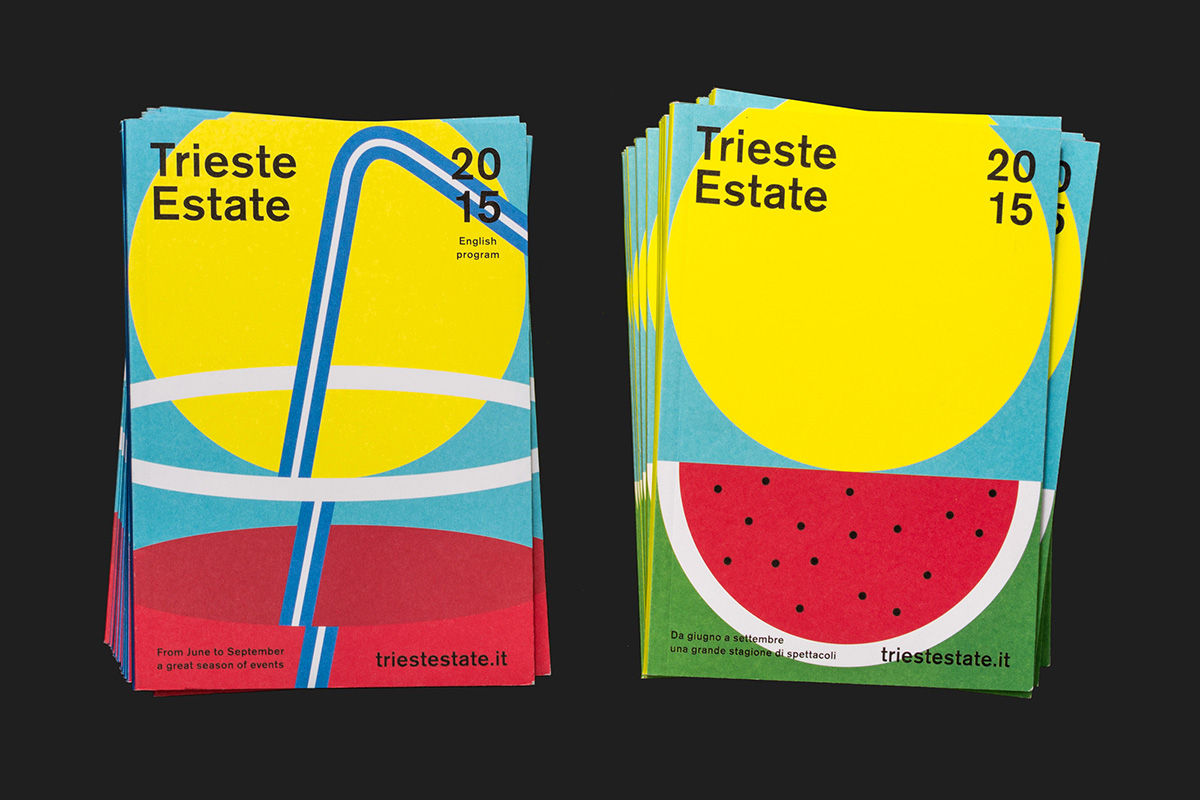
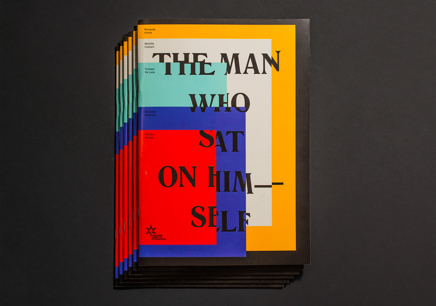

Sciencewerk
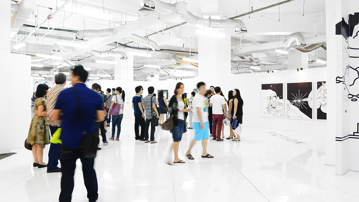
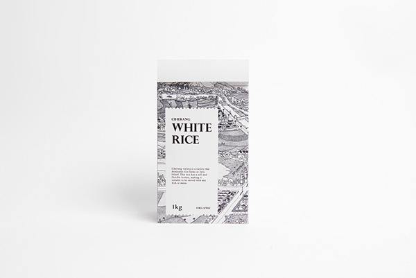
Sciencewerk® is a creative studio conjoining art, design, and technology. We always believe that good design intersect between art and science where process, collaboration, experimentation, exploration are critical. At Sciencewerk, we help people to develop visual communication and design language for their business or product through various media applications from identity, typography, graphic, print, illustration, interactive, installation, exhibition, to art. Our designers has been featured in D&AD , Crowbar, Computer Arts, Asia Pacific Design, IDN, 360 Design, Underconsideration, The Jakarta Post, Behance, among others.



David Carson (born September 8, 1954) is an American graphic designer, art director and surfer. He is best known for his innovative magazine design, and use of experimental photography. He was the art director for the magazine Ray Gun, in which he employed much of the typographic and layout style for which he is known. In particular, his widely imitated aesthetic defined the so-called "grunge typography" era.


Wim Crouwel
He designed many geometric word marks
As a designer he felt related to the Bauhaus ideas, the swiss-inspired international style. He was fascinated by the rational aspect in Bauhaus typography, which he discovered through Karl Gerstner’s and Gerard Ifert’s work.
|
MODERNIST, FUNCTIONALIST, PURIST
Crouwel is a modernist and impressed by a typeface like Helvetica, which was more neutral than any other typeface.
Jessica walsh
Designer& Art directer
Working in NYC. Her works has won awords from the type directer's club, art directer's club, SPD, print, and graphics she recieved various distinctions such as computer art's "Top rising star in design", and an ADC "Young gun.


Studio Mut
-Studio Mut is a graphic design studio founded by Thomas Kronbichler and Martin Kerschbaumer, based in Bolzano, Italy. We specialise in identity, print, editorial and web design for clients spanning art, culture and commerce. We seek for simple and powerful solutions, bold aesthetics and surprising outputs across all platforms. Our work has been described as both playful and serious, and we strive to keep the balance.


Sciencewerk
Sciencewerk® is a creative studio conjoining art, design, and technology. We always believe that good design intersect between art and science where process, collaboration, experimentation, exploration are critical. At Sciencewerk, we help people to develop visual communication and design language for their business or product through various media applications from identity, typography, graphic, print, illustration, interactive, installation, exhibition, to art. Our designers has been featured in D&AD , Crowbar, Computer Arts, Asia Pacific Design, IDN, 360 Design, Underconsideration, The Jakarta Post, Behance, among others.


피드 구독하기:
덧글 (Atom)


